Well done if you got through the previous article, it covered a lot of ground. Don’t worry if you didn’t understand or cannot remember everything. Hopefully, this article will reinforce many of the subjects discussed and how colour can help visualise harmonic information.
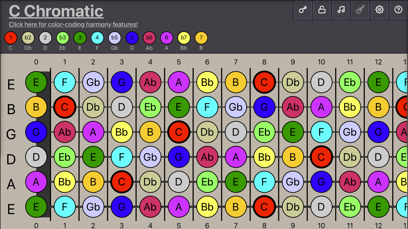
The diagram below shows a chromatic scale. Most would think of this image as particularly ugly or perhaps even infantile. It’s certainly not particularly useful. Who needs a reference to all of the possible notes? However it is intriguing that the word chromatic is also a term used in the discussion of colour.
Equal Temperament + Diatonic Harmony
However, this particular diagram helps identify a relationship between equal-temperament and diatonic scales. Above the fretboard is a Key referencing the colours. Inside of each circle, there is a number, sometimes preceded by a symbol. These numbers and symbols represent the value of each note as a diatonic reference to the root note.
Readers who already have some knowledge of music theory will probably recognize these symbols as chord tones and / or scale tones. Similar terminology also describes intervals, the distance between two notes. Though related, these are different subjects.
How Colour Provides Diatonic Continuity
As explained in the previous article, Diatonicicsm defines how chords and scales are named and how sheet music refers to pitch. It is idiomatic to modern music theory and terminology.
Each colour has been selected to represent and identify a specific note / chord-tone / scale-tone, this means that the colour-coding feature is identical for each key.
The color red represents the root note, chosen because it contrasts against the other shades. It is a particularly important note regarding the tonal qualities and naming conventions.
It’s absolutely vital to notice that notes of the same diatonic position share the same type of color. The b3 and the 3 are both shades of green. The b7 and the 7 are shades of orange-yellow.
ASIDE – colour blind? (It may be worth trying to create your own colour scheme in the preferences.)
Grouping adjacent tones together using colour provides diatonic continuity between all of the diagrams generated no matter what the root note or Key.
The neurological relationship between music and color is a unique subject. For example, some people have aural Synthesia. A neuropsychological trait where they associate sounds with a specific color. Ironically perhaps, the people I have spoken to who have aural Synthesia tend to associate individual keys with a particular color. The opposite of what Fretharmony is doing, where it doesn’t matter what key is chosen, the root note of the key will always be the colour red.
Customizing the Chromatic Color Key
Fretharmony enables users to customize the colors used to diatonically color-code the chromatic scale. If red seems like a bad choice as the root note, then change it!
Each color of the chromatic scale can be customized, and palettes can be saved for future use. Check out some of the presets for inspiration.
- Select a Color Scheme
- Open a color picker to modify the color
- Name and Save Palette
- Set the size of the fretboard
The colour scheme could be virtually anything providing the diatonic relationships (some adjacent notes) are preserved, and there is enough contrast. There are some theoretical edge-cases, especially when including overtones, but you can discover these yourself!


